
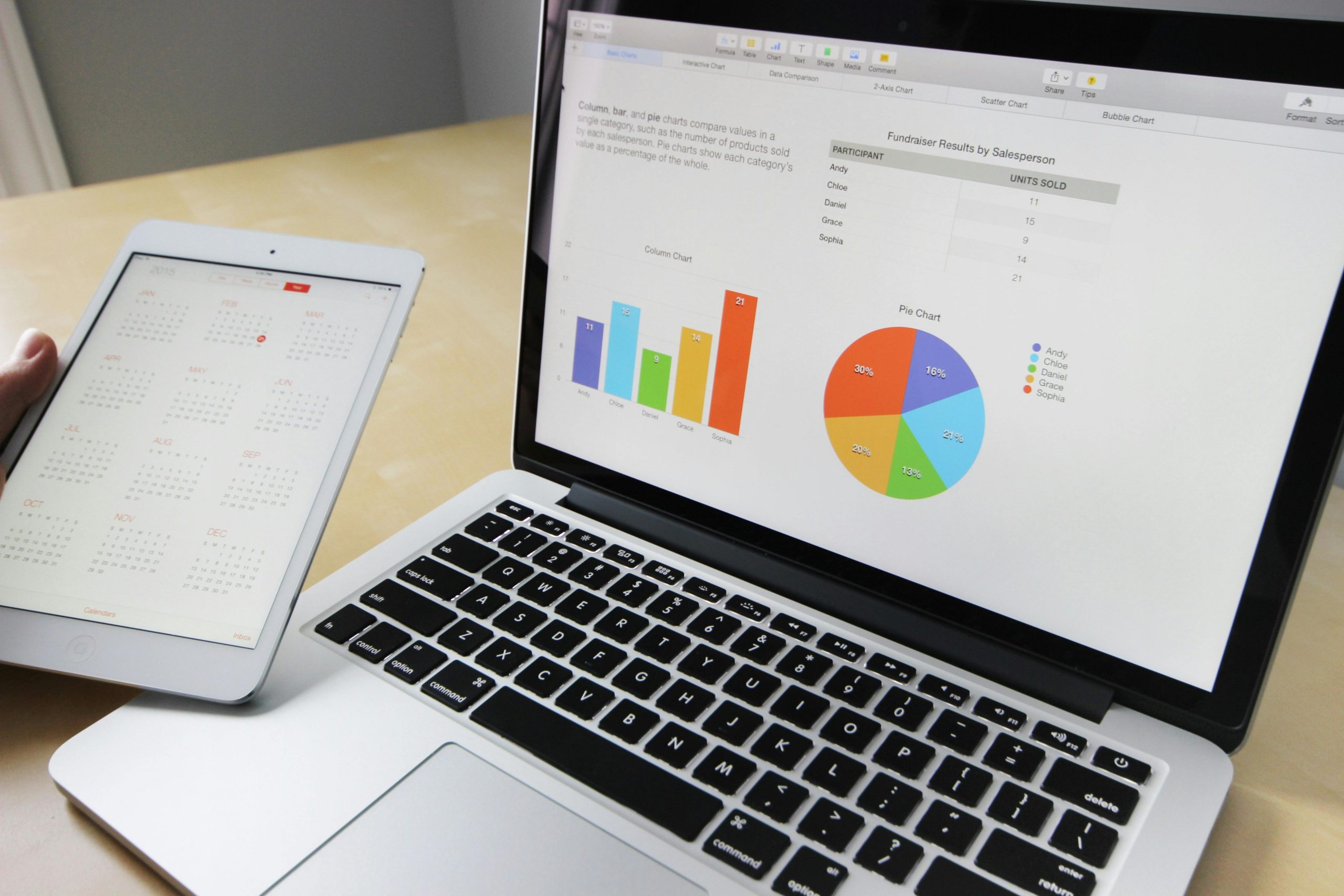
We operate in an interconnected world driven by technology, information and data, which have become the cornerstone of intelligent and strategic decision-making. The ability to to interpret, present and understand data effectively It is an invaluable skill in an increasingly competitive and ever-changing environment; that is why keeping up to date in this cutting-edge field is not only essential, but also fascinating!
Get ready to immerse yourself in an exciting reading experience where we’ll be discussing the transformative power of data visualisation and its relevance in today’s digital world. Let’s start unravelling the secrets hidden behind the data!
The latest from the world of data
The rise of social media, the widespread use of mobile devices and the increasing digitisation of services make it possible to collect a wide range of information on human activities linked to technology. Since the advent of the internet in the 1990s, the capacity to generate, process and share data has grown steadily. This capacity has grown exponentially, multiplying significantly every few years, which has necessitated the adoption of new prefixes (mega-, giga-, tera-, etc.) to handle numerical quantities in a way that is comprehensible.
What basic knowledge is required to work with data visualisation?
At present, The business landscape requires specialists across the various fields covered by data analysis, so if you haven’t yet taken the plunge into studying this subject, we encourage you to do so, as it will open the door to incredible career opportunities.
Start by learning about and working on the following areas!
- Data management: Firstly, it is important that you understand how data is cleaned and organised for subsequent analysis and visualisation.
- Analysis and visualisation tools: familiarise yourself with tools and software such as Tableau, Power BI, Python, R and Excel, amongst others, to create effective visualisations.
- Visual design concepts: Gain a basic understanding of graphic and visual design, and learn how to present information clearly and attractively.
- Basic statistics: Focus on understanding simple statistical concepts such as mean, median, standard deviation and correlation, amongst others, in order to interpret data.
- Understanding the context: Develop your ability to understand the context of the data and the problem that the visualisation aims to solve.
- Communication skills: last but not least, you should work on your communication skills so that you are able to exchange information effectively with the rest of the team. If you do end up working with data, bear in mind that you will often have to present your findings using visual aids.
Why is it so important to know how to interpret data?: the functions of data visualisation
To get the most out of big data work, it is essential to be methodical from the moment you begin data mining and extraction. However, even if the entire analysis process is carried out correctly, it is very important that it is complemented by effective visualisation and interpretation. Some of the functions and objectives of data visualisation are as follows:
- Clarity and understanding: to simplify complex data so that it can be understood at a glance, making it easier to interpret patterns, trends and relationships.
- Identifying insights: to enable the discovery of hidden information or relevant insights within the data, which aids strategic decision-making.
- Effective communication: to facilitate the communication of information and findings through visual representations, making the message more accessible and persuasive.
- Comparative analysis: to make comparisons between different data sets or variables, making it easier to identify relationships and differences.
- Support in the decision-making: to provide a solid foundation for making informed decisions based on a visual understanding of the information.
- Identifying trends and patterns: to help identify trends, anomalies, correlations and patterns that may be crucial to understanding how the data behaves.
5 Top-notch data visualisation tools for your business
And to round off this post on an introduction to data visualisation, we’ll leave you with this list of tools featuring advanced data visualisation capabilities that enable businesses to analyse, interpret and present information effectively for strategic decision-making. Make a note of them!
- Tableau: It offers a wide range of interactive visualisation capabilities, enabling the creation of dynamic charts, tables and dashboards.
- Power BI: provides a comprehensive platform for data visualisation, connecting various sources and offering advanced analysis options.
- QlikView/Qlik Sense: offers data discovery and interactive visualisation features, enabling users to explore and analyse data intuitively.
- Dome: a business intelligence platform that enables users to view and share data in real time, facilitating decision-making based on up-to-date information.
- Looker: a tool focused on data exploration and visualisation that integrates with multiple sources, providing detailed and customised analyses.
Do you find this area of smart business interesting? We invite you to subscribe to Educa.Pro and start enjoying a wide range of specialised training courses today, with no restrictions whatsoever!